Carbon Credit Prices in H1 2024
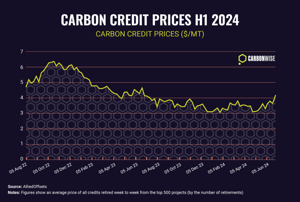
Average carbon credit prices in the voluntary carbon markets have shown signs of stabilising in the first half of 2024, after a clear downward trend that persisted through 2023, data from information provider AlliedOffsets shows.
International Climate Efforts Since 1990
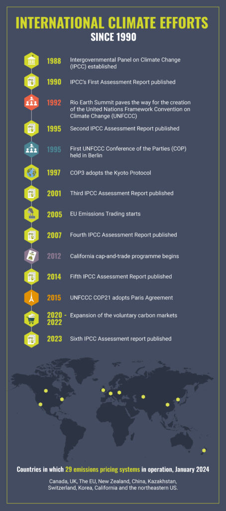
Climate efforts since 1990 have centred around the United Nations process, while in parallel, the scientific understanding of climate change has advanced, and been widely disseminated, through the IPCC’s regular reports.
A Look Behind the Numbers on Carbon Credit Retirements

Global carbon credit retirements fell by 10.9% in 2023 compared with the previous year, according to data from AlliedOffsets – a major data source for carbon credits.
Green Hydrogen: Clean Fuel of the Future
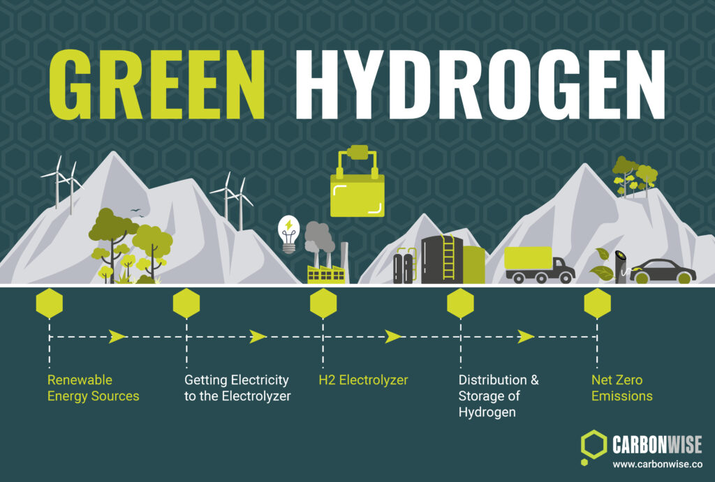
Green hydrogen involves producing hydrogen gas using renewable or other low-carbon electricity. For example, electricity generated by wind farms or solar parks is used to power an electrolyzer, which chemically splits water into its constituent parts, hydrogen and oxygen.
Emissions Avoidance & Removals Projects
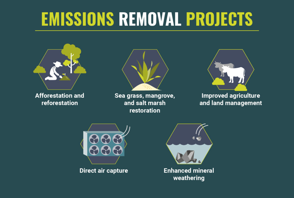
Emissions avoidance and emissions removal are different approaches to reducing the atmospheric buildup of greenhouse gases.
Scope 1, 2 & 3 Emissions
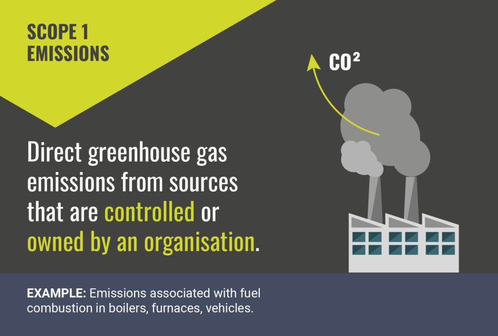
These infographics concisely define Scope 1, 2 & 3 carbon emissions and provide practical examples for each as part of a trio of visuals.
1.5°C Pathway Emissions
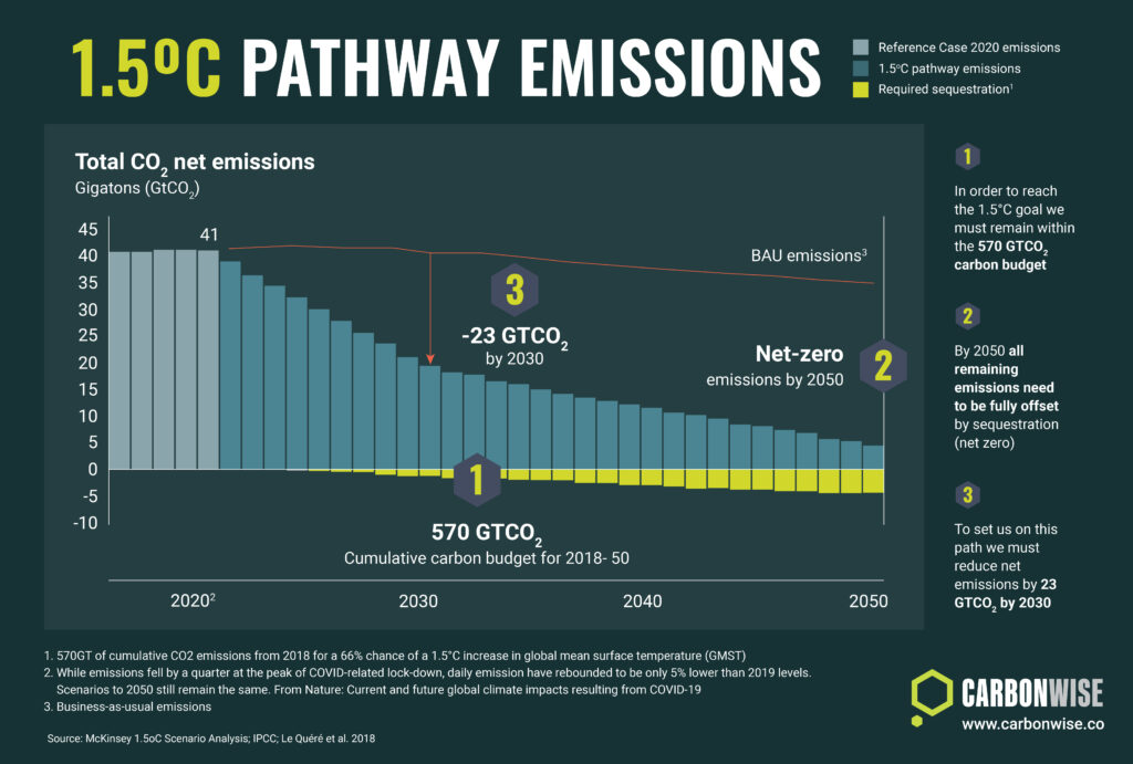
Limiting the rise of the average global temperature to less than 1.5 Degrees Celsius is vital but the question is how do we achieve this?
Global Greenhouse Gas Emissions by Sector

Global Greehouse Gas Emissions by Sector as sourced from Climate Watch, The World Research Institute, 2020.
Carbon Offsetting VS. Carbon Insetting

Companies are at different stages of their journeys towards net zero. Offsetting and Insetting are the most immediate actions they can take.