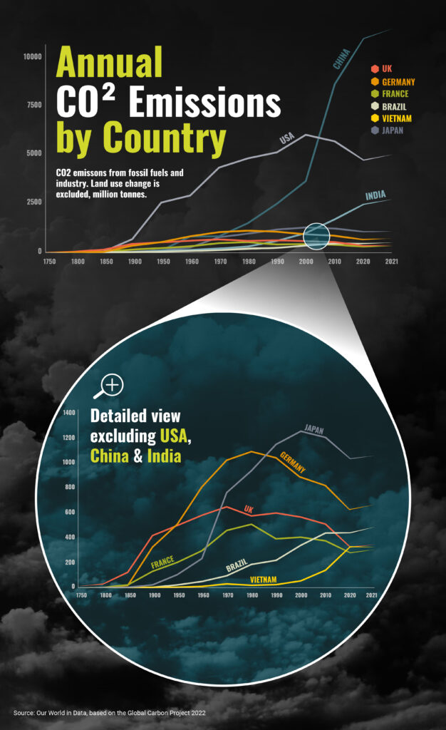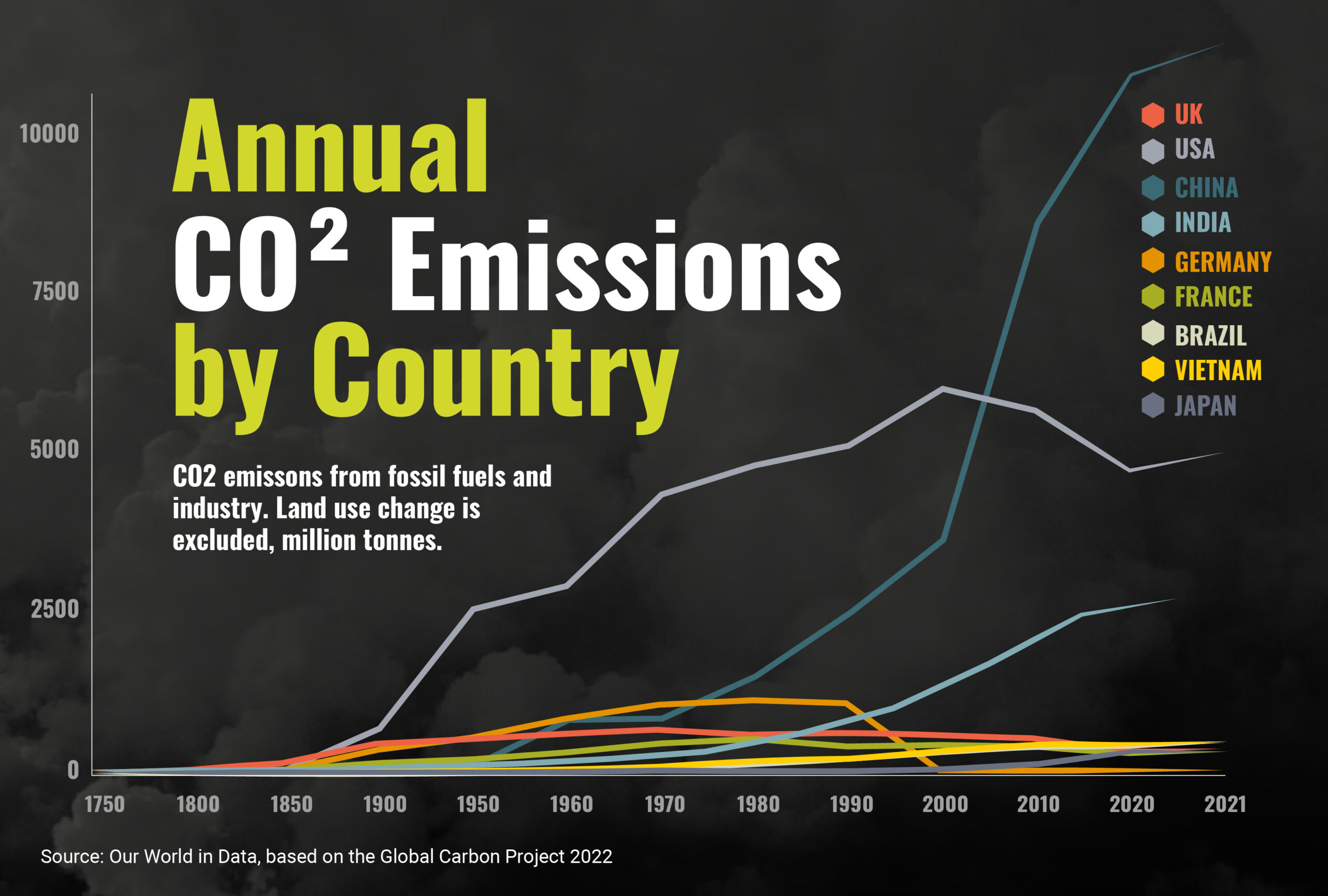
This chart, based on data from the Global Carbon Project 2022, allows you to visualise how individual countries compare on national CO2 emissions, as well as how CO2 output has evolved over time. For example, the chart highlights how CO2 emissions from the USA and most European countries peaked in the period 1980 to 2000, while emissions from China, India, Brazil and some Southeast Asian countries have continued to rise due to greater reliance on coal for electricity, coupled with strong economic growth.


